I have seen it again and it’s becoming worryingly popular. More and more organisations are committing to degrading the NPS® question and their ability to analyse survey results is deteriorating.
Introduction: the NPS Colour-Coding Issue
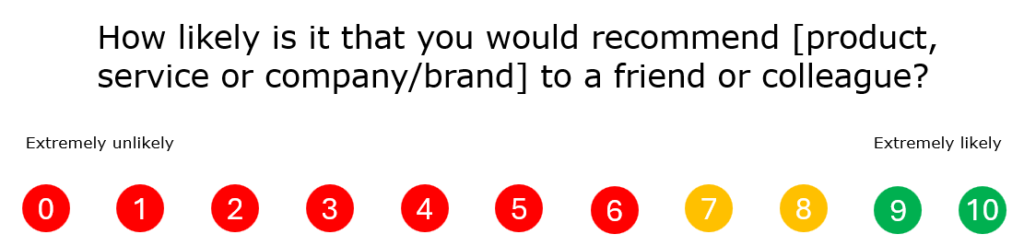
I am referring to the increasingly common practice of colour coding the 0 to 10 scale of the NPS question (“How likely is it that you would recommend [product, service or company/brand] to a friend or colleague?”). In particular, I am alluding to the use of three colours across the 11 values of the scale, grouping them up into three categories.
Good-looking surveys are more memorable, and visual information is always easier for the brain to process. I get that. But what if this improved look and feel design introduces an undeniable bias into the question? Are you still comfortable when your supposedly neutral and honest survey question is now transformed into a completely different question, with a corrupted scale and meaning?
Understanding the NPS Scale
According to Bain & Company1, the Net Promoter System (NPS) question focuses on measuring the likelihood to recommend and the depth of passionate loyalty. Using a scale of 0 to 10 allows the NPS to be calculated by taking the first seven values (0-6) as Detractors, 7 and 8 as passives and 9-10 as Promoters. The fact that more than half of that scale falls into the Detractors group gives us an idea of how the NPS works, only considering Promoters as the most enthusiastic customers who would give a 9 or a 10 to the question. Only 2 options out of 11 (18.2%) would be classified as Promoters, same for Passives and 7 out of 11 (63.6%) would count as Detractors. So the NPS scale is effectively quite demanding.
The Problem with Colour-Coding
Applying those 3 colours to the scale means that it’s no longer a 0-10 scale, but it’s indeed a 3-point scale: red, yellow/orange and green. We have changed everything and now each group equally covers 33.3% of the options, removing the demanding attribute of the NPS.
We can understand why some organisations would give their customers the option to categorise themselves as Promoters, Passives or Detractors. That shows well-intended transparency. However, not everyone is fully conscious of the definition of those three categories, let alone the mathematical formula behind them or the way to analyse the score. Therefore, the general public will tend to position themselves in a positive manner rather than a negative. Promoter sounds like a way better group to be part of rather than Detractor, doesn’t it?
Alternative Presentation Strategies
So unless we want to consider using alternatives to NPS on our questionnaire, we should ensure neutrality when using this question. For that, we either present it in unbiased plain text or assign a unique colour or image for every single value of the scale. I’ve read articles recommending the use of emojis for that. Well, good luck finding 11 different emojis and preserving it all unbiased.
Recommended Best Practices
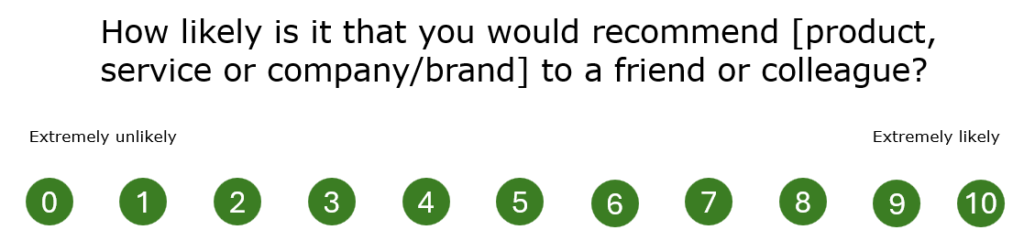
We can probably find the right balance between the unbiased way to present the question and a distinctive way to improve its look by using a single nice colour for each number. The corporate colour would work wonders for this and won’t corrupt the scale.
Moreover, if we are extremely keen to use colourful designs and get carried away with our favourite design tool’s possibilities, we can implement a transition of colours from red to green that matches the transition of the scale from 0 to 10. That would give a clear visual clue to the respondent without adding any bias.
However, if you attempt to create a gradient between the initial red and the final green you are going to hit the wall when trying to integrate the yellow/orange tone in the middle. And if you decide to ignore that midpoint and just focus on a scale of colours between red and green, your passives are going to look green-ish now, which somewhat introduces a different kind of bias to your question.
Based on that, I’d personally suggest the version that uses one single colour across the scale, keeping it simple and not trying to find shortcuts to best practices polished by millions of CX professionals and enthusiasts who have faced the same situation over the years.
Conclusion
The most important aspect of an NPS survey is the accuracy of the data. While colour-coding might make the scale visually appealing, it’s crucial to prioritise clarity and avoid introducing potential bias.
References
1 Reichheld, F., & Markey, R. (2011). “Introducing: The Net Promoter System“. Bain & Company.
Net Promoter®, Net Promoter System®, Net Promoter Score® and NPS® are registered trademarks of Bain & Company, Inc., Fred Reichheld and Satmetrix Systems, Inc.